Marketplace and design system
Designing a product marketplace from discovery to UI, then building the design system behind it so design and engineering could share one language.
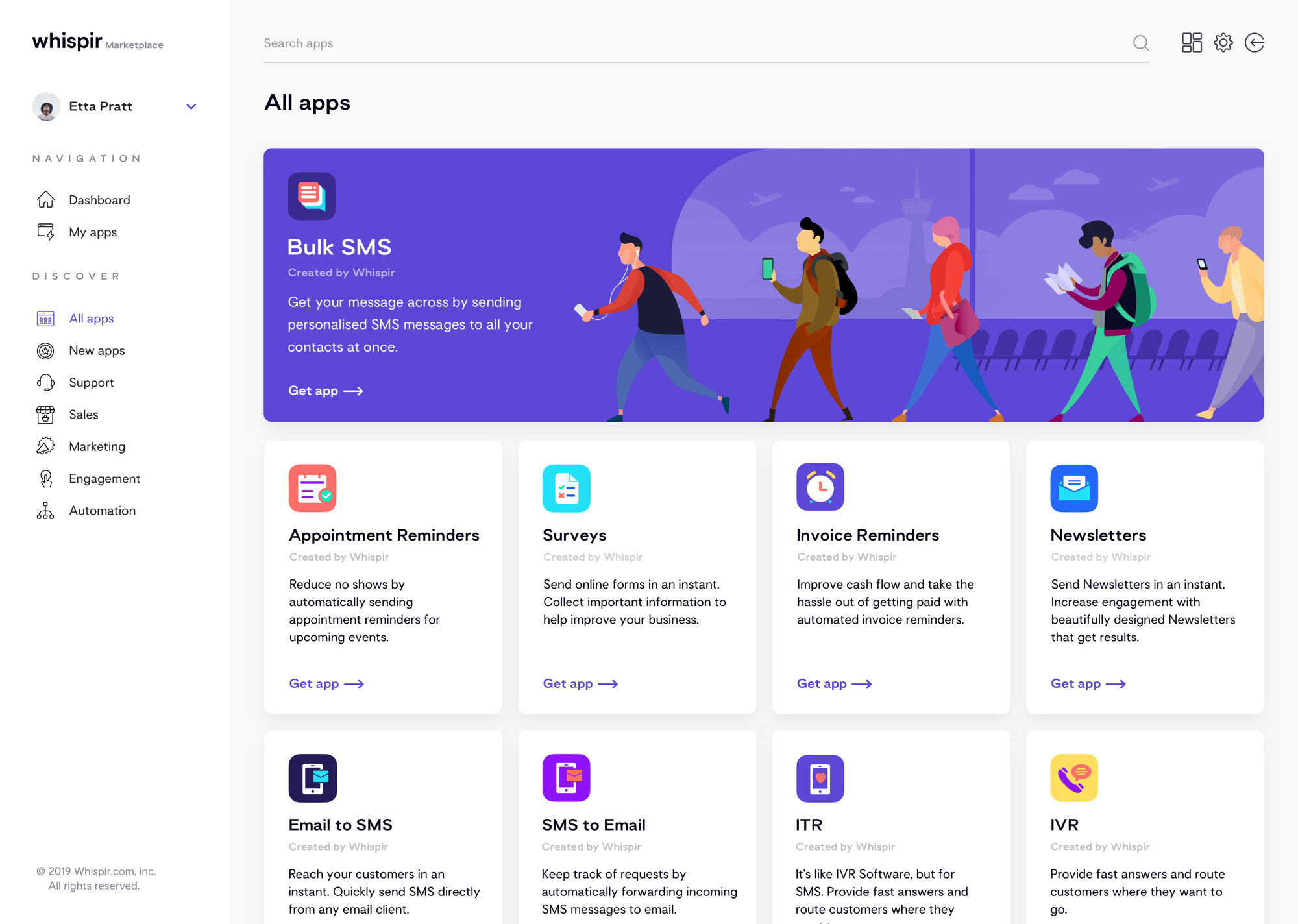
A storefront for ready-made communication apps
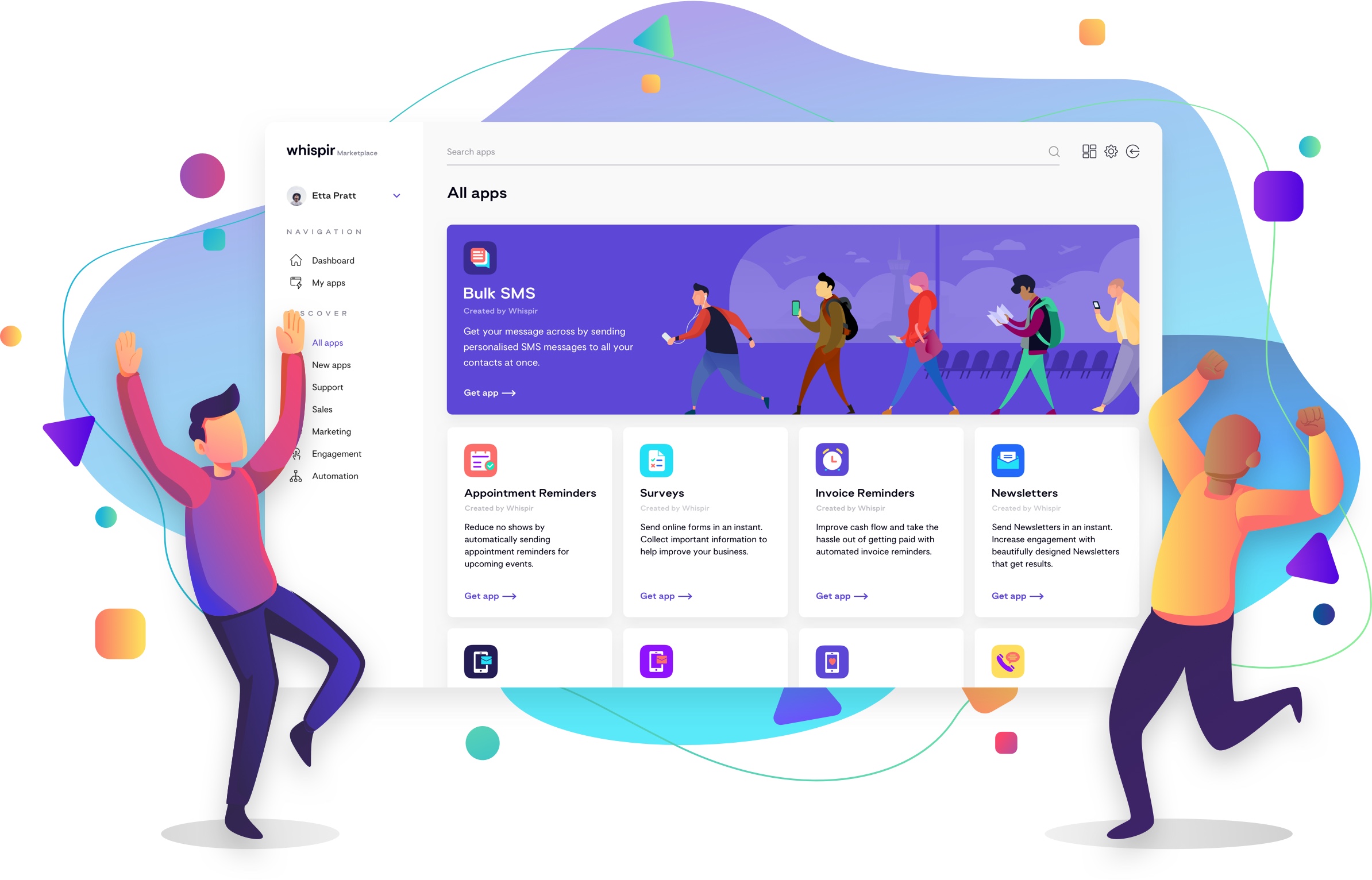
Whispir Marketplace was a storefront for buying ready-to-use communication applications. I was responsible for the visual identity of this new product line, from the marketing landing pages to the storefront itself.
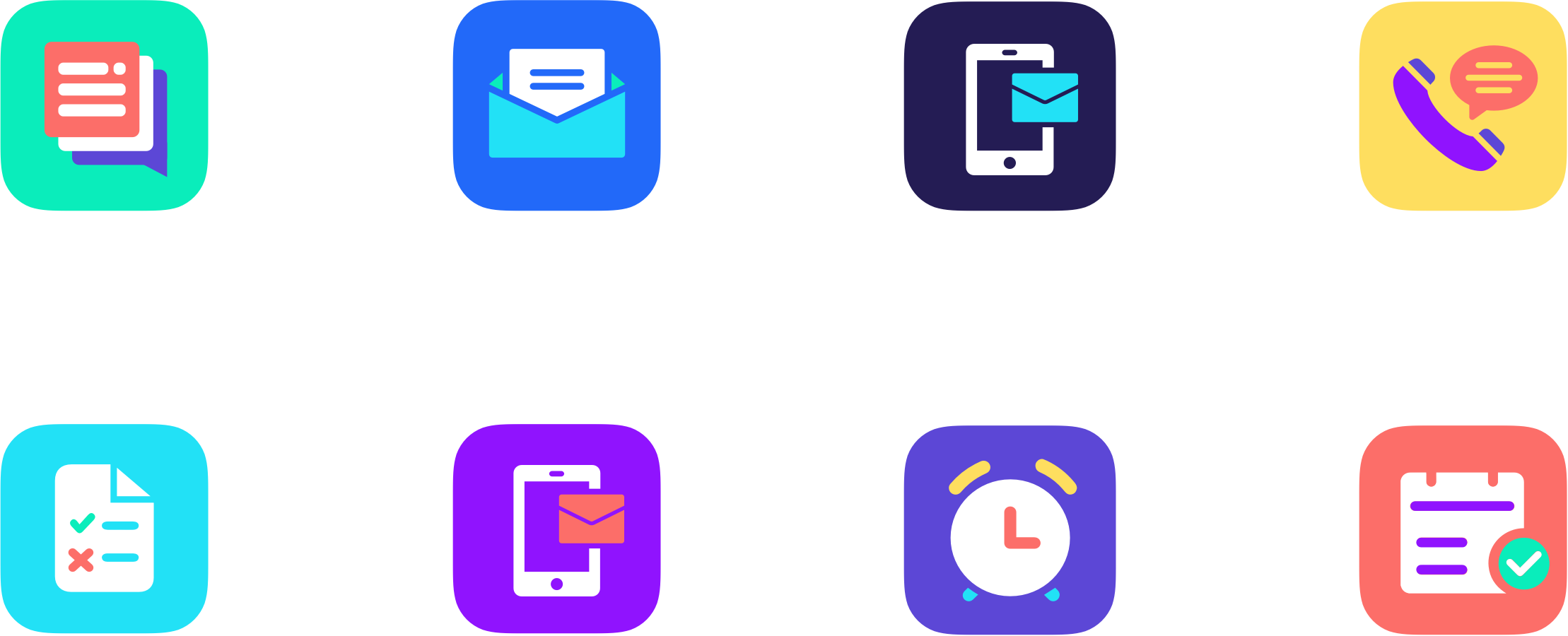
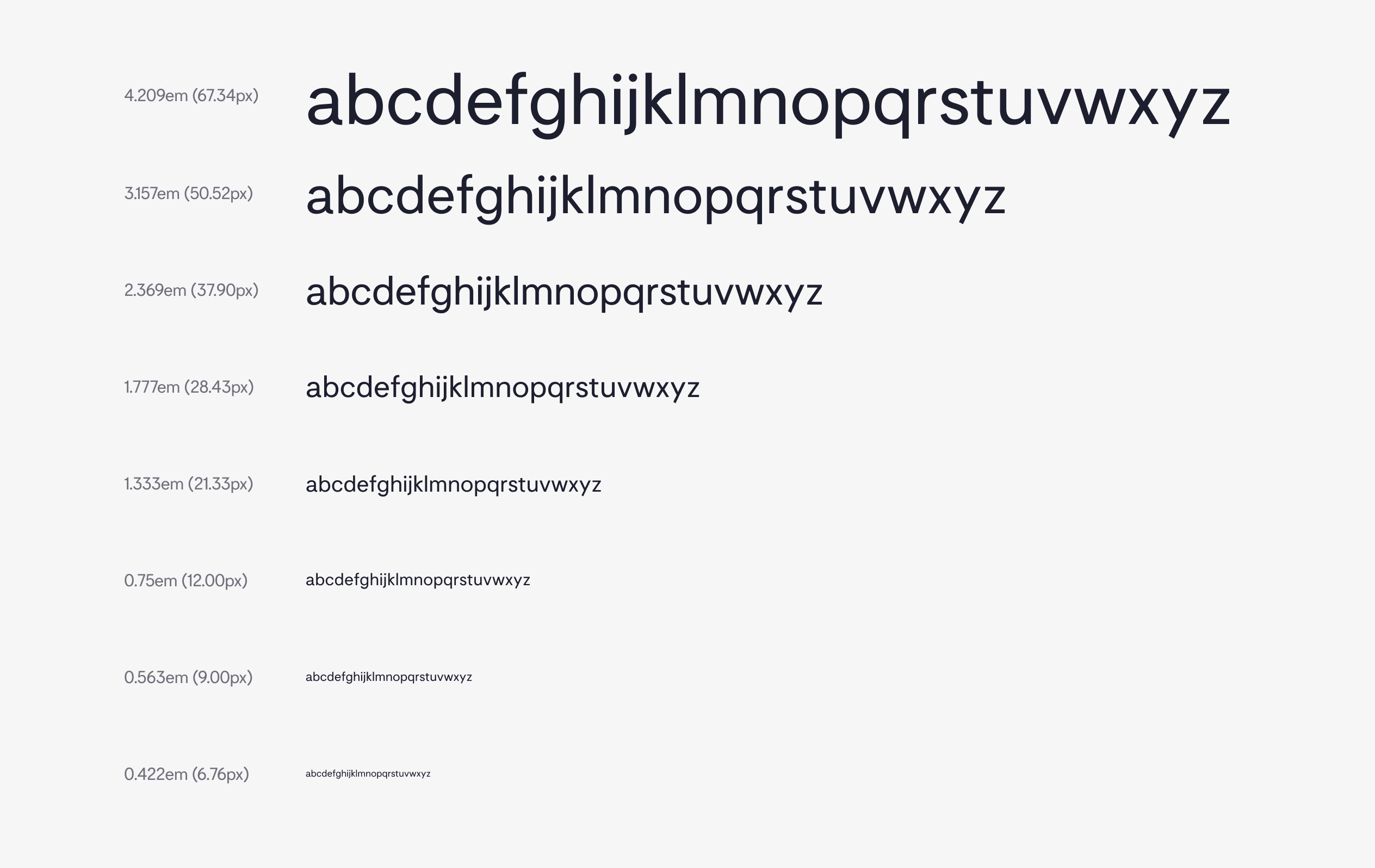
Competitor marketplaces tended towards minimal grids and filters. We chose to bring in personality through vibrant colour and illustration, and used the Capisce Display and Motivo typefaces to tie the sub-brand back to Whispir.
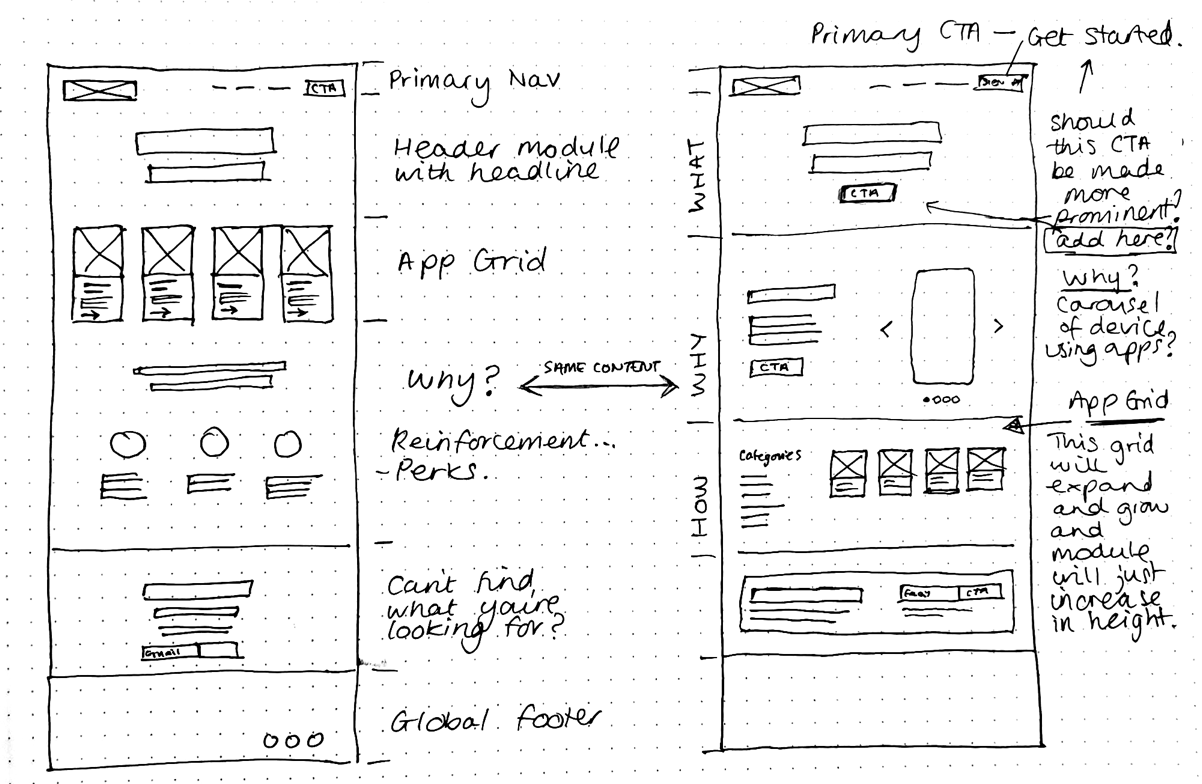
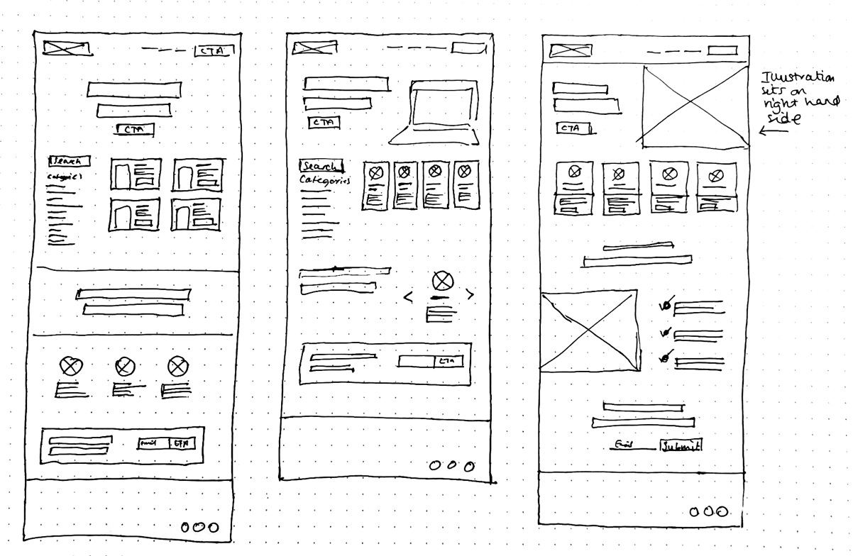
Atoms to pages
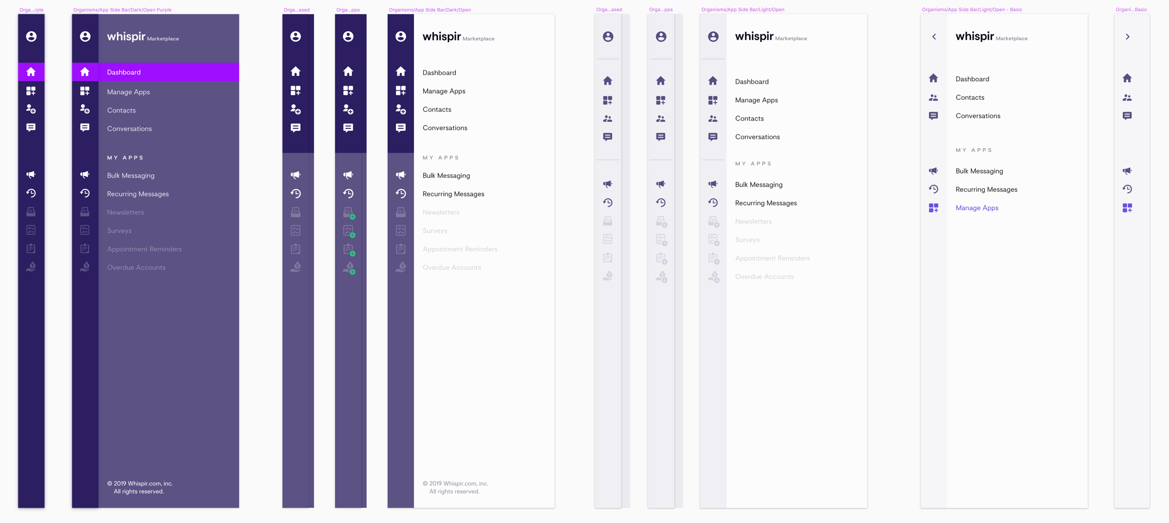
I set up a master pattern library in Sketch using Brad Frost’s Atomic Design methodology, organised to match the structure of the existing Whispir platform, then moved it into InVision’s Design System Manager so design and development worked from one source of truth.
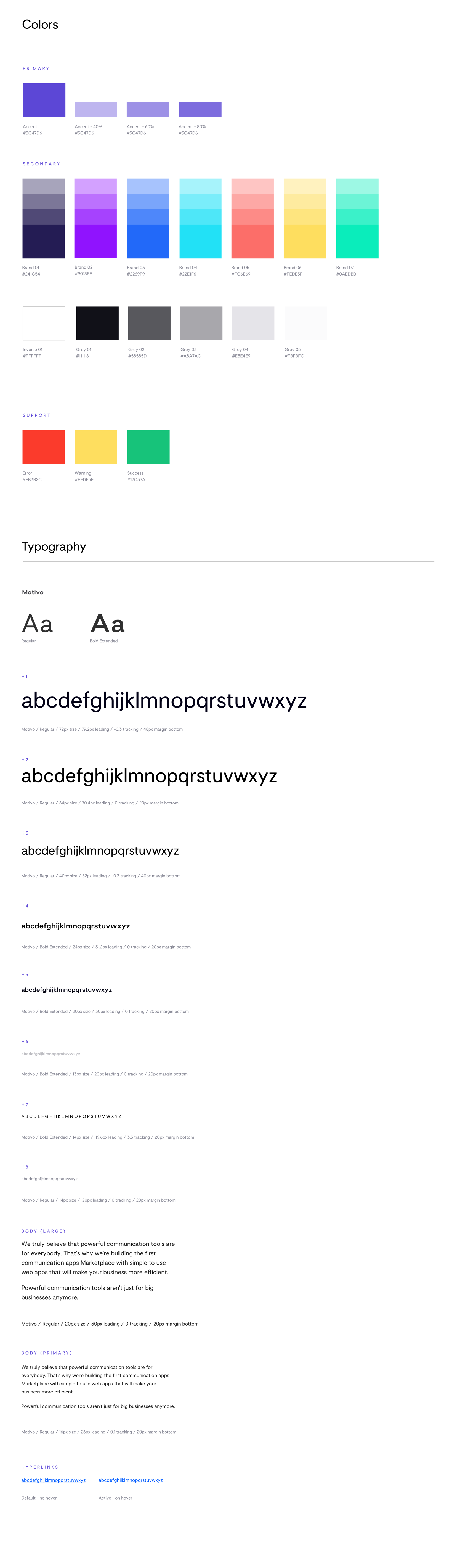
A React component library in Storybook
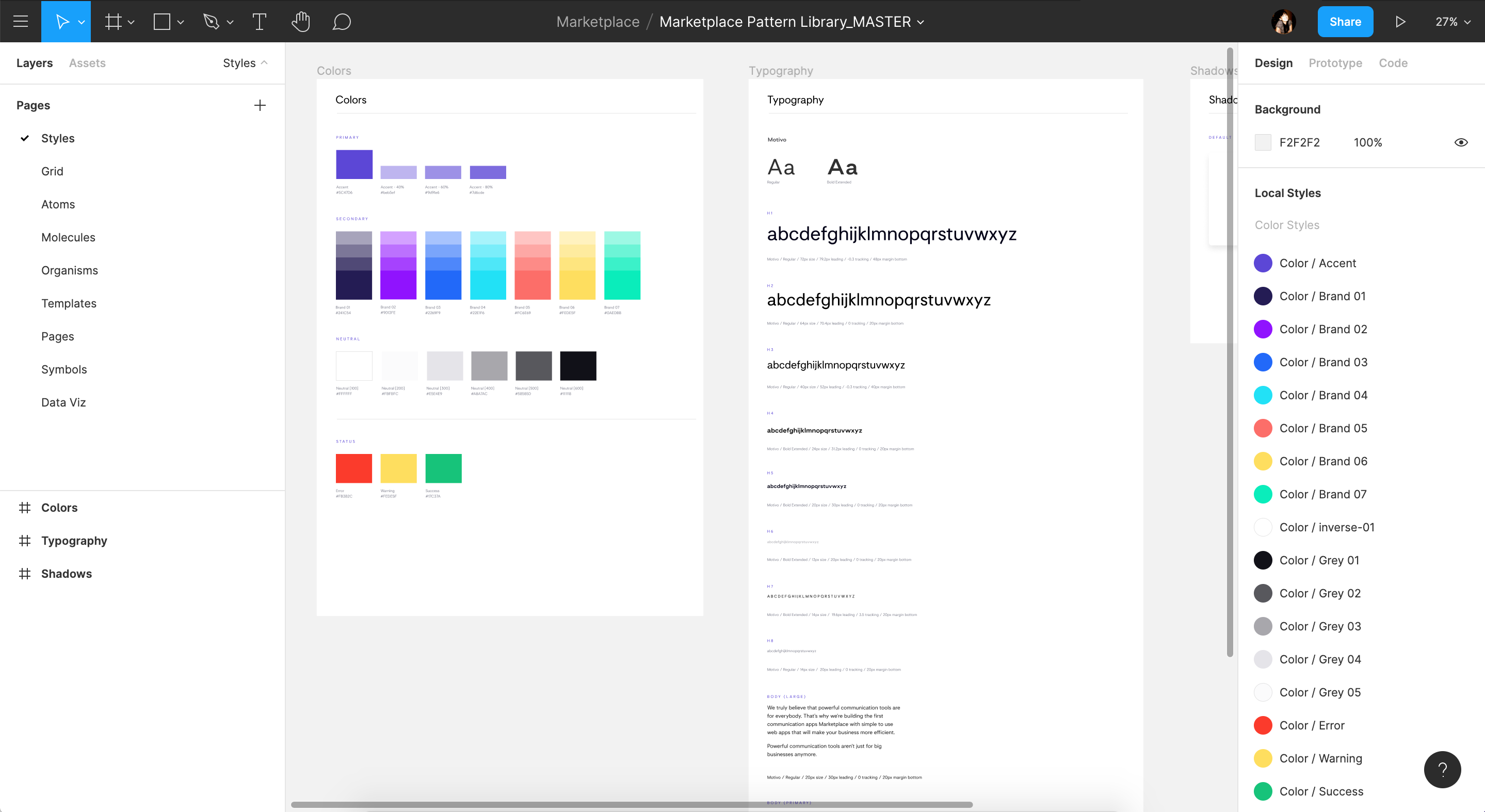
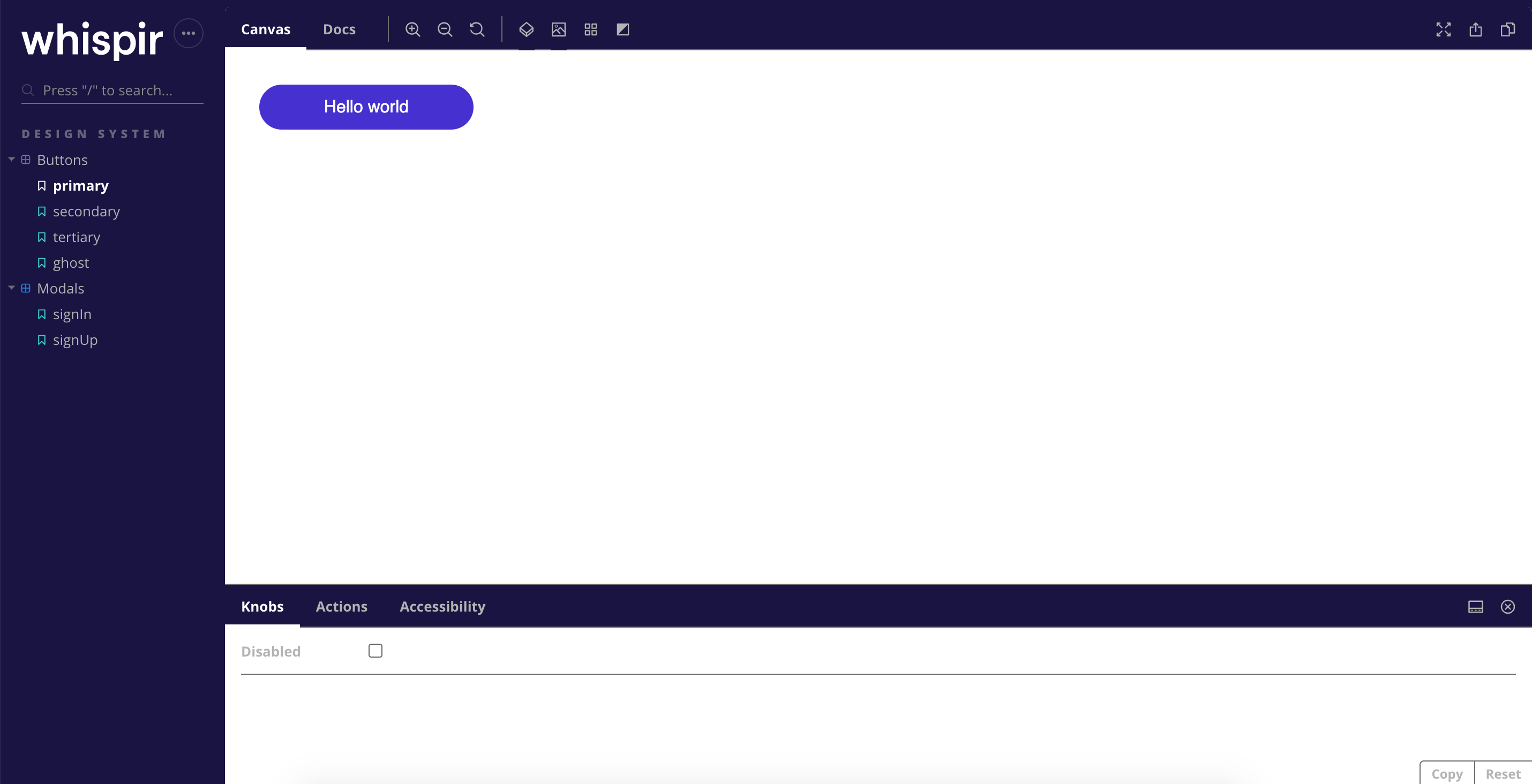
Once the product designs were approved, I built the design system itself: a React component library and style guide, with the Figma library and Storybook organised the same way so the team shared a language.
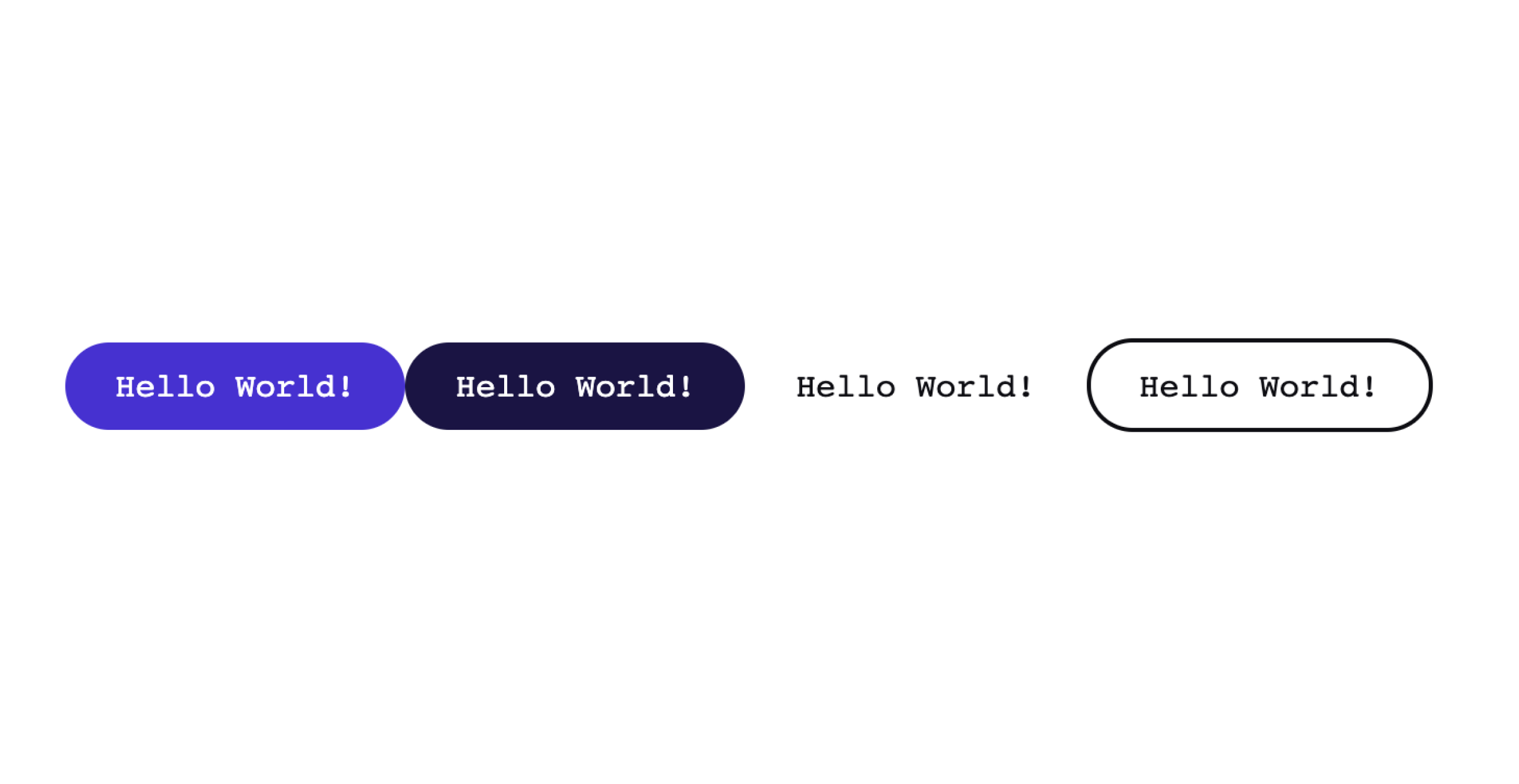
Adoption metrics showed buttons and modals had the widest use, so they came first, built with styled-components in primary, secondary, tertiary, ghost and icon variants, with every state covered. A 16px base and a Perfect Fourth type scale set the typography, and a theme toggle switched between light and dark. Storybook was set up with accessibility testing and deployed on Netlify.
Rescoped, and still consistent
Development constraints meant the standalone marketplace was rescoped into the existing beta platform. Because the design language was consistent, most of the illustrations, buttons and typography carried over with only small colour changes. The store soft-launched in October 2019.